Wednesday, December 31, 2014

12 Days of X-Mas: X-Force #25

Wow. Raise your hand if you remember these insane hologram covers. These things seemed pretty awesome on the trading cards of the time, I’m not sure it works so well just glued on the cover of a normal comic book. It is still cool, but it certainly prevents any uniform type of look on those covers.

So this is part of the Fatal Attractions storyline, almost a crossover, but not quite. There is a “mystery” villain, but I’m going to go ahead and spoil Magneto’s involvement now (20 years later). But while Magneto is the big bad of the issue, most of the fighting is between X-Force and Magneto’s disciple Exodus.

I always like it when Magneto uses his powers in a way that makes sense. After lurking in shadows for most of the issue, when it comes down to it, Magneto and Cable finally battle it out. Now, Cable is a half-metal cyborg, so how long do you think that fight should go? Fabian Nicieza does a nice job keeping Cable’s involvement an overall “win,” but boy, that is a short fight. Cable honestly shouldn’t have much of a chance against the master of magnetism. Since Cable manages to bring most of his recruits home and save the Professor (the AI program that helped raise Cable), he can claim a win, but c’mon, Magneto whipped up on ol’ Nate.

This is one of those issues where the rich history of the X-Men really makes for some interesting interactions. When Exodus takes most of the team up to Cable’s former spaceship, the mystery antagonist might still be shadowed to the reader, but the characters have no doubt about who they are speaking with. Cannonball and Sunspot spent years with Magneto as their mentor, so when he shows up as the mastermind, they aren’t concerned. It is pretty neat seeing the way Magneto sort of backs down and flatters his former students too. The characters’ history makes the moment work.

Greg Capullo does another nice job with the art in this issue. Exodus is a bit of a challenge, though. Not only is his 90’s look ridiculous, but I have absolutely no idea what his powers are. When Exodus uses his vague powers take on the X-Force team, it just looks like big blasts of random energy. Seriously, what the heck can he do besides be ominous and menacing? (And sport a sweet mullet?)

Another thing Capullo’s art really emphasizes is how strong the team line-up is at this point. Rictor might look like another 90’s bozo, but aesthetically, his green and brown toned costume really looks good in the group. Warpath’s red and blue still takes up a lot of space on the panel, contrasting with Shatterstar’s white, Feral’s orange, and the pinks and yellows for Boom Boom. Capullo does a really nice job with the team action, and Nicieza has the personalities and power sets into an interesting and useful mix. This is a well-rounded superhero team.


This isn’t a great comic, merely GOOD, but it is an easy, fun read. The art keeps the book interesting, and frankly, using Magneto makes the book feel more important than it has so far. This is definitely on the stronger side of the X-Force books I’ve sampled so far. 

Tuesday, December 30, 2014

12 Days of X-Mas: X-Force #15

Here we go, Greg Capullo! 

And man, does the art take a turn for the better! Capullo is a respected artist and huge draw now, but this is one of his earliest assignments, so he’s nowhere near as polished as he is on Batman. That said, there is no denying the immediate improvement in storytelling and anatomy that he brings.

Capullo gets to show off with a couple nice fights, too. Deadpool vs. Cable works out pretty well, with Deadpool rocking some Spider-Man poses as he throws down with Cable. I can’t say I understand why Cable wants to go punch-for-punch with DP, except that it looks cooler and more “comic book-y.” 

Capullo is the best X-Force artist (so far) at drawing women too. Domino looks fantastic. Without her metal facemask and in some conveniently torn clothing, she looks fantastic. As a more mature reader, I question why her pants now look like a thong and how she got a conveniently placed hole on the chest of her costume, but I’m sure younger Timbotron didn’t mind.

The other fight goes by a tad quicker, but still shows off the team’s powers nicely, Crule suddenly re-enters (almost like a movie skipping back a few seconds) and comes after Cannonball once again. I swear, it is like a few panels of last issue just get erased and Capullo gets to do them over with his better pencils. Is that possible? 

This time, Cannonball barks out some orders, setting Shatterstar and Feral after the close-quarters combatant. It’s pretty neat seeing Cannonball treated like an effective team leader. Sam Guthrie was one of my favorites when I was younger, and THIS is how I liked seeing him. Confident and battle-trained, he’s much cooler than he was in the earlier issues. More importantly, with Cable gone, there is actually a role for Cannonball to play. With Cable around, Cannonball barely deserved a few lines of dialogue. Now he’s making decisions and recruiting his best friend Sunspot back onto the X-Force roster.

Man, do I like Siryn. Her costume is so dynamic and cool; I can’t help but like her. That under-arm cape is tremendous! And while Liefeld made his mark drawing Shatterstar and Feral, Capullo is no slouch. Both characters look really nice in these pages. I remain stunned that Shatterstar’s padded facemask can look so neat under so many artists’ pencils! Crule, though? He’s awful. From his name to his generic look, I’m remembering why I blocked this storyline from my memory all those years ago.

This GOOD comic is back to being art-driven, but now it is being served by Fabian Nicieza’s plot and pacing. This is the best it has been since I started re-reading.


Tomorrow, we see how the X-Force team responds when placed into an X-crossover…

Monday, December 29, 2014

12 Days of X-Mas: X-Force #14

We are in uncharted waters here, folks. I chose this issue to review because I thought it was the debut of dynamic penciller Greg Capullo. (You may have heard of his Batman work? Or Spawn?) But it turns out Capullo only did the cover, and the interior pencils are by fill-in penciller Terry Shoemaker. 

Shoemaker’s art is fine, but it is a bit cartoony. It’s brighter than Liefeld’s crosshatched work in the first issues. I think I see some Chris Batista-like details in the faces, and Larry Stroman’s style in the figure work. So a book that launched to feature the artist is saddled with a workmanlike fill-in, but clearly the art-driven direction of the book is taking a back-seat.

Fabian Nicieza is still writing, and things have cleared up nicely. The book opens with Cable and Domino infiltrating Tolliver’s estate while Cannonball and the rest of the team take on SHIELD. This era is clearly part of the confusing Externals plot, a storyline I have worked hard to block from my memory. The silly-named Crule shows up to kill Cannonball at the end of the issue, because… I think the Eternals are sort of like Highlanders? There can be only one… (maybe?) The main team doesn’t have much time to decide on their future plans. There is some talk about a long-term plan for the team without Cable’s influence, but they can’t really decide on a plan before Crule’s arrival.

I remember being very surprised by the other big development in this issue. When Domino and Cable get inside Tolliver’s home, they find Domino tied up against the wall. That’s right; the Domino who has been appearing in this book since the New Mutants days is in fact Vanessa, Deadpool’s sometime girlfriend. The real Domino has been captured and tied up for all this time. I do appreciate that Cable seems to zip through Tolliver’s other flunky at the close of the issue, setting up a big Cable/Deadpool throw down for next month. Of course, Deadpool seems to kill regretful Vanessa as he arrives, so it isn’t all fun and games.


While the art isn’t as fun as the early issues, the plot does move along more smoothly. Having Nicieza plot and script his own stories does seem to have improved the pacing of the issue. This is still only a FAIR comic, but it is getting better as the pacing and story improve. 

Sunday, December 28, 2014

12 Days of X-Mas: X-Force #4

Here we go! Rob Liefeld must have been focused on this issue for the past few months, because this book looks a ton better than issues 2 and 3. The horizontal layout challenge must have been a fun one, because Liefeld’s art hasn’t looked this good since issue 1. Sure, Cable is still wearing that absolutely atrocious metal armor with the prongs; and Cable’s thighs are still unbelievably huge, but almost everything else in this book looks better than the last two books.

Liefeld’s Spider-Man is distinctly McFarlane-esque, which makes sense since this story crossed over with McFarlane’s title. There are almost no backgrounds throughout the entire issue, but that time seems to have been made up in details on the core characters. Juggernaut (sporting glowing red eyes in most panels) looks demonic and dangerous. The mutants battling him look great, with some nicely detailed panels for Siryn and the other ground-level fighters.

The storytelling suffers on the Cable-centric pages. Either Cable is walking or the hand holding his huge gun is just mysteriously switching for no reason. If there were backgrounds or more of a sense of motion, I’d probably know which it was, but as I said; no backgrounds. Cable also acts like a tough guy in his panels, blasting Black Tom as he dangles down an elevator shaft. Somehow missing at point blank range, Deadpool just pops on panel to rescue Mr. Cassidy before he buys the farm. 

Unfortunately, the Tolliver sub-plot bleeds over into this story big time, with Deadpool porting out Juggernaut too. And after the heroes had just gotten his helmet off too! (Now, I’m not certain how much a difference that made. It sure doesn’t seem to me that even the entire X-Force team (plus Spidey) could stop Juggernaut. Juggs is no worse for wear after 30-plus minutes fighting the heroes. This is a well-choreographed boss fight that really feels big-time thanks to the horizontal page gimmick.

Spidey just doesn’t fit in that well with the X-folks here. (This is in the married Spider-Man era, so it was nice to see Spidey making references to Mary Jane.) There aren’t really any good “connections” for Spidey among the X-Force roster, so there aren’t any great bonding moments. It’s too bad; I know Fabian Nicieza could do more if there was a kindred spirit amongst Cable’s young troopers. Heck, I think the strongest bond for the web-slinger is Juggernaut due to their past conflicts.


Tomorrow I’ll be jumping ahead in the X-Force chronology, so this wraps up the initial “Liefeld era” of the title. I remember liking it, but not loving it. Reading it over 20 years later, it doesn’t hold up that great. The art is more uneven than I remembered, although the sense of kinetic action is still strong. I still think Liefeld’s greatest strengths are his character design and frenetic action sequences. When the story slows down, when I have time to really pore over the anatomy, I have a lot of questions. But dangit, I still like the overall energy of Liefeld comics! 

Saturday, December 27, 2014

12 Days of X-Mas: X-Force #3

Oh my gosh, three issues in, and I’m having a hard time. Rob Liefeld’s art, which was so nicely laid out and designed in issue 1 is really starting to look rushed. The thighs and general anatomy of the characters has gone out the window. I mean, there are panels where Warpath’s waist looks thicker than Juggernaut’s whole body! And Cable’s armor, oh my gosh, it is awful. There are two strange sharp prongs that look like they should be jabbing ol’ Nathan in the face during every fight. Juggernaut looks OK, but most of the characters really don’t look good.

But that isn’t a universal comment, because once again, Liefeld seems to be spending a lot of time on Shatterstar and Feral. Both characters look more completely penciled in. Their cross-hatching is more detailed. They have more lines on their uniforms and faces. In general, these two look the best every single issue. The list does grow here, though. Black Tom Cassidy is nicely realized on the page here. From his fantastic, over-the-top villainous posing to his moments in battle, Black Tom looks good. 

Siryn, for the most part, looks good too, but there are a few iffy panels for her too. Adding Siryn to the team does wonders for the color scheme of the team. With this early 90’s coloring, the pinks, purples, and silvers were not looking good. Only Warpaths’ blue and red really breaks up the bland-looking team. Adding Siryn's greens and yellows really breaks up the page.

I love Fabian Nicieza’s dialogue for Black Tom and Juggernaut. They sound like classic comic book bullies. It is weird seeing this much talking between Warpath and Juggsy, but it is amusing seeing the tough guy posturing. Plus, any book with a “Krathakapow” sound effect is OK by me!
  

This book is a set-up for issue 4, the “all-horizontal” issue guest-starring Spider-Man. Issue 3 doesn’t stand too well on its own, but it does pull the book out of the nosedive of issue 2. Issue one remains the high point of this FAIR series. 

Friday, December 26, 2014

12 Days of X-Mas: X-Force #2

Kane! Weapon X! With the power to shoot his hands and feet off like a broken toy! I can’t remember if he had more powers, but those are the only ones he uses in this issue. The opening pages are as dynamic as the premiere issue, but man, the overwhelming RED on the page makes it hard to enjoy. I know you can’t change someone’s costume design, but having Deadpool and Kane throw down just makes for an overall sense of red bleeding over the entire page.

In fact, I’m not sure if it is the coloring or printing errors, but this book is full of problems. Boom Boom’s awful costume is mis-colored on one page. Cable’s face is pure yellow in on another. The quality control on this one wasn’t too high, I think.

Rob Liefeld’s pencils are not as tight as in the first issue, and the anatomy on some of his figures seems more off than normal. I don’t expect realism in comic art, but I’m pretty sure that Warpath has three elbows per arm in one panel. In fact, a lot of the cast doesn’t look great here, with the grimacing and wincing through the roof. BUT, Liefeld still makes Feral and Shatterstar look tremendous. I wonder if Shatterstar was his favorite? That padded mask actually looks cool to me!

In issue 1, Fabian Nicieza really throttled back the caption boxes. They are back with a vengeance here. Kane in the opening sequence, and Feral in the back, the dialogue is heavy and obvious, not the best I’ve seen from the writer. He does do a nice job with Deadpool’s dialogue though. It’s so weird seeing the character show up in this comic as a villain. He’s working for “Tolliver,” who I don’t even remember!

The main plot isn’t a barn-burner. GW Bridge wants Kane for his anti-X-Force team, and Feral loses control and guts Cannonball while on a training exercise. I’m much more excited about the cliffhanger; Black Tom Cassidy has kidnapped Gideon and Sunspot. PLUS, Tom has just rescued the Juggernaut from a non-corporeal state.


This AVERAGE issue isn’t quite as fun as issue 1, but I’m anxious to see the team go after the Juggernaut. 

Thursday, December 25, 2014

12 Days of X-Mas: X-Force #1

Merry Christmas! I hope everyone is having a nice holiday season! 

Once again, I’ll be doing a special theme for the 12 Days of X-Mas as I look at an older X-Men comic, series or theme. Over the years, I’ve changed from a more general “X-Men” theme to looking at a specific series. This year, we’re looking at volume 1 of everyone’s favorite 90’s creation: X-Force! Launching in 1991, this is going to be interesting. I haven’t read these issues since early high school!

A lot of people say a lot of things about Rob Liefeld, but I have to say, I’ve always enjoyed his work. The pencils aren’t the most realistic, but that sense of dynamic action on every page really pops. One thing that really struck me as I re-read this issue was the panel layout of each page. Liefeld never goes for a straight grid. Each page is unique, with smaller insets, partial splashes, and odd patterns and colors set behind the panels. In some cases, I had a hard time figuring out what order to read the panels, but for most pages, I found myself pleasantly engaged by the non-standard layout. Some of the background patterns even reminded me of Snake Eye’s Arashikage tattoo!

Fabian Nicieza provides the dialogue, and one thing absolutely blew me away. There is almost no narration in this issue. The story is told through dialogue, either yelled or spoken. We don’t have the yellow boxes of modern comics to tell us what is happening. That’s an even more impressive factor considering how much is introduced in this debut issue. We meet the X-Force team itself, their main target Stryfe, and his team of mutants the MLF. We see X-Force’s new HQ established. And simmering subplots are introduced with SHIELD’s G.W. Bridge.

In our debut issue, the core team is fairly straightforward. Most of the characterization is focused on Cable. There are elements of his past that I do not remember AT ALL. I forgot he kept his powers hidden from the team when this series started. I had totally forgotten that he had a father-son relationship with some dude named Tyler. I think Cable and Domino are still together in this too, but I’m pretty sure that gets retconned at some point soon.

As for the rest of the team, Domino is Cable’s girlfriend. Cannonball is the earnest young soldier seeking Cable’s approval. Shatterstar and Feral are both wildcard brawlers. Warpath is almost totally silent, although Cable does allude to the fact that Warpath’s strength seems to be increasing. Plus, I forgot that Sunspot was trapped in narrative limbo with the Externals and that silly guy Gideon. Oh man, I’m dreading that External plotline.

I really love Warpath’s costume. That is such a classic look; I wish the character was appearing in something more regularly. I also can’t resist the design on Shatterstar. That padded facemask, the double blades, the half-cape. Let’s face it, that’s a great 90’s design. Feral is pretty basic, but I LOVE that huge afro. Domino looks better without the weird shell facemask. I think her look here is not flattering. Liefeld really does have a knack for costume design. Cable’s huge vest, guns, shoulder pads couldn’t be more 90’s. I know it is silly, but c’mon, it’s also pretty awesome! I also love Stryfe and the MLF. Boom Boom and Cannonball have the worst costumes in the comic. The choice to go with pink as the primary color for both is a mistake, and the accent colors only make it worse. Oof, Cannonball has looked so much better!


All in all, this issue is an intellectual property bonanza! There are so many ideas and concepts tossed out in the premiere issue that I can’t help but find this comic dang entertaining. I don’t think it is just nostalgia to say this comic is GOOD!

Wednesday, December 24, 2014

Tomorrow... the 12 Days of X-Mas!


Don't forget the best part of the holiday season! A look back at old X-comics in the
12 Days of X-Mas!

Tomorrow!

Monday, December 22, 2014

Trillium TPB

Wow. That was… insane. Jeff Lemire certainly isn’t holding anyone’s hand in this unique Vertigo series. For a book that only lasted for 8 issues, a whole lot happens, a whole lot of insane ideas get laid out, and I got a whole lot confused.

First of all, a warning: if you are going to read this book, please make sure to read the helpful narration boxes at the opening of each issue. There are a few instances where I breezed over the caption and missed very helpful guidance. Like, for example, how to read the comic book I was holding. That led to me having a much more challenging time than Lemire intended.

OK, the quick summary of what happens in this: Nika is a far-future human colonist seeking a rare flower capable of curing a sentient virus called the Caul. Nika is negotiating with aliens when the book opens, trying to gain access to a vast field of Trillium on their lands. William is an English soldier suffering from post-traumatic stress disorder as he accompanies his brother through 1920’s South America. And these two characters’ paths intersect!

I won’t ruin the how, and I can’t really ruin the why. I’m not sure what the overall “point” of this story is, exactly. But that doesn’t stop Lemire from delivering some rousing action and heartfelt moments that really make this book entertaining. There are only four characters that have any real relevance to the plot, along with a sentient A.I., yet by the close of the series, I feel like the points of view necessary for the story all worked well when viewed through those eyes.

I’m not huge devotee of Lemire like some, so while I found the story engaging enough, I didn’t love the art. It is fine, and the storytelling is perfectly clear. But Lemire’s indie style doesn’t mesh perfectly with my obvious super-hero tastes. Again, the art is perfectly capable of setting the scene and telling the story. But no one looks pretty. Since I mention it so often, I’m going to commend Lemire on his backgrounds. Each location is instantly established by a rich, detailed background that really helps ground the scene. With a story that confuses time, place, and identity so much, the surroundings are essential to establish a clear narrative. Lemire realizes this and lays out the story clearly for his readers.


This isn’t my normal type of comic, but dang, I do enjoy reading GOOD, mind-bending sci-fi. This is the type of thing that would make a kick butt movie, too. 

Friday, December 19, 2014

Batman: Noel HC

It took me three years to read this hardcover. It isn’t that it is super long, but I felt that a Christmas story like this should be read about the holidays, and the narrative is so dense and purple that I’m afraid I couldn’t get through it. Three years in a row I tried, only finally managing to finish this year.

Let’s get the good stuff out first. Lee Bermejo’s art is beautiful, realistic, and striking, as always. His Catwoman looks poured into her shiny leather suit. His Superman is a golden god with a unique take on the S-symbol that has clearly inspired other artists. The Joker is a horrific, realistically-scarred madman. You can’t look at Joker and not feel queasy. Every aspect of the art is a triumph. The flashback costumes of yesteryear. The batmobile that looks like it is ready to rocket off the page. Even the coloring is luxurious.

But man. The story. This is the story of Scrooge if he were Batman with a cold. Bermejo never lets an opportunity for convoluted language and symbolism to pass him by. Bermejo is so desperate to make sure this story is “adult” and serious that it is an absolute chore to read. My god, I’m exhausted just thinking that Bruce Wayne’s quest on crime is the same as Scrooge’s lack of Christmas spirit.


This is a beautiful comic that hurt me to read. So overall, an EVIL comic, but let’s not take away from Bermejo’s immense talent. As an artist, he’s unmatched. 

Monday, December 15, 2014

Aquaman #36

Never underestimate the power of a good guest-star. My feelings on the new 52 are old news at this point, but I still found myself excited at the prospect of a Martian Manhunter vs. Aquaman throw down when this cover was solicited. After some positive reviews from my local comic store, I decided to drop a few bucks and see how Aquaman is doing these days.

Color me surprised! Jeff Parker is one of my favorite writers, so I had high hopes for his take on the character. He doesn’t disappoint, with a proactive, intelligent Aquaman with lots of allies and a lot of help working on Atlantis’ current problems. The last I saw Martian Manhunter, he was on the outs with the league, but things certainly seem like they are totally fine here. J’onn is trying to help Aquaman figure out what happened to his mother on the night of her death. Unsurprisingly, things are not as Aquaman believed. Seeing an eventual battle between the two heroes was probably inevitable.

What makes me the happiest here is that I don’t need to worry about the new 52 continuity at all. Tula is here as an Atlantean guard. Mera is still the supportive partner/equal that she’s been the whole time. I don’t have to pretend that Martian Manhunter isn’t meeting Aquaman for the first time. Believe it or not, that goes a LONG way for me to be able to enjoy these comics. I simply cannot re-read origins and “first meetings” over and over again as DC editorial tries to figure out what happened and what didn’t.

Man, seeing Paul Pelletier’s fantastic art really drives home how much I’m missing in the DCU. A lot of the creators are folks whose work I really like! The dang continuity and ever-present dour tone are keeping me away from comics I normally would have bought!

Pelletier’s Martian Manhunter is pretty awesome, but I sort of wish I could see the “real” take on the character; you know he’d look even better. I haven’t seen Mera’s powers used to make a giant, hard-water proxy before, but man, that is one incredible looking page. Very nice stuff.


So. Amazingly enough, I think this GOOD comic is going to have me buying Aquaman. At least until I have to pretend that I don’t know who someone is in the new 52. 

Friday, December 12, 2014

My newest obsession, Spotify!

I usually talk comics. Occasionally TV or movies. But I'm just as obsessed with music. I've actually been focused there in recent days. So no new comic review... BUT

If you enjoy Alt Rock, Indie Rock, or heck, just plain Rock, check out my current obsession, Spotify! I've been making mix tapes and CDs since 1992, and I'm getting all the playlists up onto Spotify. If you enjoy my comics reviews, perhaps you'll enjoy seeing how I became obsessed with Brit Pop in the 90's!

Here is my 2014 Playlist. If you dig it, give me a follow! (My username is 12167692409).


Monday, December 8, 2014

Superior Foes of Spider-Man #17

(To be honest, this is more a review of the whole run.)

How do I continually get my heart broken by series like this? Regular readers know that I don’t care for a lot of the headliner Avengers titles these days. Instead, the best team books seem to be the ones hanging out on the fringes of the Marvel U. Heroes for Hire, Mighty Avengers, MODOK’s 11, Mystery Men, Thunderbolts, I could go on and on about the best Marvel team books. And Superior Foes deserves to be in that conversation.

I picked up this series because when I chatted with artist Steve Lieber at a con, and he seemed really excited about the book. Not only did I get a great Snow Job sketch, but I also found a fantastic series.

Historically and almost thematically, this series picked up after Jeff Parker’s wonderful run on Thunderbolts. I wasn’t tremendously familiar with Nick Spencer’s work, but from the opening pages of the first issue, this series boasted top notch characterization, laugh-out-loud moments, and an entertainingly confusing plot. The Sinister Six (who have only 5 members) consist of Boomerang, Beetle, Speed Demon, Shocker, and Overdrive. This mix of classic, new, and legacy villains was a delightful ensemble. Even though Boomerang was a raging jerk, you couldn’t help pull for the guy. With supporting appearances from Mach-V, Chameleon, Silvermane, Punisher, Owl, and a lot more, this was firmly planted in the Marvel U.

Of course, as we learned in this issue, we have had a darn unreliable narrator for the entire series. Boomerang isn’t exactly trustworthy. The last issue (like many of the others) has a lot of late reveals and explanations that our guide didn’t want to let go too soon.

Spencer really proves himself in one aspect. He leaves the Marvel U richer than he found it. Boomerang has had some moments of characterization before. But the new Beetle being Tombstone’s ambitious daughter? Overdrive pining to eventually become an Avenger? Who knew that Speed Demon had a soft spot for dogs? And Shocker, truly, his potential is the most surprising (or not). These goofballs are the type of characters that drew me into the Marvel U when I first discovered it as a kid. The costumed villains can have lives just as rich (or richer) as those of the super-heroes.

Aside from a few fill-in issues that couldn’t live up to the standard set by the rest of the series, this run is the child of Spencer and Lieber. The book wouldn’t have worked without Lieber’s art. In addition to solid super-heroics, Lieber shows off a tremendous sense of comedic timing. His art direction seamlessly flows between drama and comedy. And his action scenes? He rarely if ever delivers them straight. If there is a fight in an issue of this book, you are going to get something new and special. The pacing of the fight scenes keeps the book moving at an amazing pace. Sure, the world is never at risk, but a LOT happens throughout this run. Lieber’s gritty but clear pencils are key to making that fast pace work.


Folks, this is an EXCELLENT comic. The type of comic you can look back on fondly and realize that you’ve discovered a hidden gem. 

Wednesday, December 3, 2014

The Energy Analyzer in December

The Energy Analyzer is going dark for much of December as I focus on one of our favorite annual traditions, the Twelve Days of X-Mas.

Here's a hint about this year's selections...


Monday, December 1, 2014

Avengers: Adapt or Die TPB

In my ongoing confusion about Jonathan Hickman’s Avengers opus, a little clarity is appreciated. So we are finally getting the sort-of-origins of the Mapmakers. I even appreciate that the beings are sort of tied to some existing villains in the Marvel U (the now-headliners in AIM). But man, why did this origin story have to involve YET ANOTHER ALTERNATE EARTH. 

Seriously, folks, This is getting ridiculous, right? All of Hickman’s Avengers. Superman/Batman. Earth-2. Multiversity. Half the DCU. Are we really so out of normal story ideas that one Earth is not enough? And we can’t even just have 2? I mean, this zeitgeist confuses the hell out of me. I like What If’s as much as anyone else, but seeing the Evil Avengers running around as the spotlight characters just seems pointless when it is so hard to get quality time with the real Avengers. 

And now we are adding in time travel too. I know this is going to be a major plot point coming up, but man. Why can’t we just get normal Avengers stories? Why are there two or three or four versions of characters running around?

I hope folks aren’t coming to this book hoping for action starring the Avengers. Because when the real Avengers are lucky enough to be on-panel, they very often are just talking. Animatedly talking, sometimes, but discussing things. The action and quality fisticuffs I enjoy in my comics are almost always reserved for alternate versions of our leads.

Maybe it is just me, and I read comics totally differently than other folks. But for me, the types of conflict happening in Uncanny Avengers and Mighty Avengers are much more what I’m looking for from Marvel’s premiere super-team.

Again, Marvel is putting top notch artists on this title; you can’t say Hickman has had to suffer with sub-par artists. Salvador LaRocca and Esad Ribic are some of the biggest guns in Marvel’s arsenal. I just wish they were working on a title more my speed. The art is the undisputed highlight of this run for me.


This EVIL comic is another huge miss for me. 

Wednesday, November 26, 2014

Multiversity: Pax Americana #1

Well, no one can accuse Grant Morrison of pandering. I consider myself a fairly sophisticated comic book reader, but this was a difficult comic to get through. In addition to the unique presentation of the story (Morrison starts at the end and works backwards), the art is a challenge as well. I noticed that the sense of motion on the page was unique, but it took interviews for me to realize that Morrison was explicit in his instruction to artist Frank Quitely. Most if not all of the pages lay the motion out in a figure-eight style; infinity on a comic page.

There are a few ties to the overall Multiversity plot, but more than any of the other one-shots so far, Morrison seems to be telling a self-contained, experimental story. Clearly, Morrison is challenging himself (and his readers) with this one-shot. That might even be more of the goal than furthering the Multiversity core plot.

I have a ton of affection for both of the “sources” for this issue. I love the Watchmen; it blew my mind when I first read it. It obviously still holds up as one of the best stories ever. But at the same time, I have sort of moved away from the dour, grim, and depressing attitude that permeates its pages. Alan Moore’s intellectual exploration doesn’t accept much of the inherent joy of super-hero comics. And that is the tone that Morrison is directly channeling here. Captain Atom isn’t really Captain Atom in any way I recognize. He’s totally the distant, thoughtful Doctor Manhattan.

That brings me to the other source. The Charlton super-heroes. My exposure to them began in DC comics, the versions of the characters we see here are in no way related to their DCU counterparts. They have the same mental afflictions, guilt, and neurosis of the Watchmen. It is almost painful seeing Quitely’s beautiful take on Blue Beetle, Nightshade, and Peacemaker, but to see the characters in such a unique and off-putting presentation. This is Rorschach, not the Question. This is Nite Owl, not Blue Beetle. Heck, in a world that produced a million Before Watchmen titles, I wonder why DC didn’t just make an Earth-Smiley for the Watchmen to live on.

This is a challenging, challenging read. Much like the issue of Earth-Me, this comic takes characters I am very fond of and presents them in a way that really leaves me wanting more. This is good stuff. The story is interesting. The art is absolutely wonderful and immersive. But man, am I the only one who finished this and thought “man, I’d really like to read about these characters in a normal book?”

So I probably sound like a moron. I can accept that. This is a comic that simply must be re-read in order to understand Morrison’s message (or even get close). I understand sales were insane at my comic shop, I wonder how most people responded to this? Surely the average new 52 fan isn’t keen on treating a comic book like a college-level English discourse?


This is a GOOD comic, because it is so challenging. But I can’t give it an EXCELLENT, because Morrison is determined to make me work while I read. This comic isn’t one for relaxing and unwinding. You’d better bring some paper to take notes. 

Monday, November 24, 2014

Constantine: The Spark and the Flame TPB

I’m pretty much DC’s target audience for this book. I have never read a pre-52 appearance of John Constantine. So seeing him in this series, where he acts pretty much in line with his portrayal in Justice League Dark? It doesn’t bother me at all seeing the character “watered down” like I’ve seen folks saying online. Sure, Constantine seems pretty vanilla, but he’s not offensive to me. This is one instance where the new 52 gave me a nice clean start to try the character. Maybe this is what all those “new readers” felt like when the relaunch happened.

Jeff Lemire and Ray Fawkes have an interesting pitch for their take on Constantine. It is all about taking from the universe, and hoping that the debt doesn’t come back to bite you. Constantine is a classic anti-hero tough guy. He’s constantly letting folks down, escaping by the skin of his teeth, and lying. But he generally does it for the greater good. He’s a scumbag with a heart of gold, and thanks to his verbose internal monologue, he’s easy to root for. It is easy to see why everyone in his life hates him, but the reader is on his side.

Part of the charm of the rascally rogue is that he has so many dang friends. He’s got allies and acquaintances showing up to give him a hand at nearly every stop along the plot of this trade. And each time, I found myself concerned more for Constantine’s friends than for himself. The writers did an excellent job making it clear who would pay for Constantine’s mistakes. (Here’s a hint, it’s not him.)
There are a lot of classic characters showing up here, mostly turned into villains. The original Sargon the Sorcerer is replaced by his daughter, a cruel murderess who seems like a good potential arch-villain. Mister E makes the most of his time too, another character whose name I recognize but who I have no exposure too. And when the Spectre shows up, he’s the version of the character I recognize; another positive.


Renato Guedes is the most recognizable penciller in the trade, working clearly in the current DC house style. The consistency with the super-heroic line just reinforces the feeling I got from the cover of this FAIR TPB; Constantine is just another super-hero. His powers even look like a Green Lantern’s. 

Friday, November 21, 2014

Captain America & the Mighty Avengers #1

Well, it is official. We can now put Al Ewing on the list of Marvel writers who seem to be there to serve my kind of niche audience. The kind of talented writer who uses humor, action, and a solid knowledge of Marvel continuity to deliver modern stories that make me feel the way I did when I was a kid discovering comics. Some writers can strike it big with this style. Guys like Mark Waid and Dan Slott are still big comic industry names now. Others carve out solid chunks on solid books; writers like Jeff Parker, Christos Gage, and Fred Van Lente all do these books with smaller audiences, but are often my favorite. We’ll have to see where Ewing ends up, but just as he did in his first volume of Mighty Avengers, he’s proving he gets the Marvel U better than a lot of big-name Marvel writers.

I do have to question the decision to open up the new volume of Mighty with inverted FalCap and Luke Cage, though. Ewing handles them superbly, of course. FalCap is inverted from Chaotic Good to Lawful Evil, and Luke Cage has done the same. Falcon’s transformation is more unsettling, as Sam Wilson embraces violence and an overpowering love of his country that excuses all sorts of super-hero infractions. He seriously injures low-level thugs, all the while thinking that they are getting off easy. The most alarming part is seeing how he is justifying all this aggression through his newfound dedication to the real America.

Luke Cage is a bit more standoffish, that’s his biggest inversion. Not only is he totally unwilling to forgive Spider-Man for his “Superior” time, Cage also is more motivated by money than ever before. Part of the Hero for Hire gimmick was that Cage rarely got paid, but the inverted Luke Cage won’t stand for that. I can’t mention Spider-Man’s appearance without giving Ewing props for the awful, uncomfortable, and dead-on page of Spidey apologies. Spider-Man has a lot of awkwardness built into his character, but that usually only manifests when he’s Peter Parker. Seeing poor Spidey so discombobulated and uncomfortable is hilarious and just makes you feel for the guy.

Just like Mighty Avengers, I read this book with my daughter. She LOVED Parnival Plunder and his bad guys. It’s silly to think that the Plunderer has enough importance to be included among the inverted, but man, does it work. The urban pirate theme, the revealing and familiar banter amongst his underlings, the use of first names! All of these things made Parnival Plunder’s appearance in this book a special thing. My daughter was very upset to see this “villain” and his henchmen get beaten so badly. She read Cap #1 with me, so she knows the real FalCap, but man, she was bummed out.

Luke Ross is an artist I’ve liked for years. His solid pencils are always a nice fit for super-hero action, and the art is solid once again. I am particularly impressed with the way he draws the new Cap handling himself. From the high-altitude shield-throw to the absolutely brutal office takedown, the sense of motion and action on the page is tremendous.


Any comic that makes me think of Monty Python’s Meaning of Life has to be a GOOD comic. When those pirate ropes slapped against the glass, I thought for a moment we were getting the first in-continuity appearance of the Crimson Permanent Insurance pirates!

Wednesday, November 19, 2014

All-New Captain America #1

Man, do I love this comic. I’ve been a fan of Rick Remender’s Marvel work for years now. Stuart Immonen is one of my top 5 comic artists. And I love the Falcon. So this was not a hard sell for me. But seeing these three beloved elements come together into such a strong combination is still a joy.

Rick Remender has really picked up the comedic dialogue in all of his books recently. I noticed it in Uncanny Avengers and Axis first, but the style continues here. Falcon has some tremendous asides and one-liners as he takes on hordes of Hydra goons. But the high point of dialogue, without a doubt, comes from the mysterious super-villain of the issue; Batroc the Leaper. Batroc is in a new hooded outfit that I don’t quite love, but man; his anti-American rant is just top-notch. (The ONLY thing that brings me down in this premiere issue is the possible final fate of Batroc. But we don’t’ see a body, so I’m not going to freak out yet.)

I also find it interesting that Remender is continuing the buddy-aspect of the title too, just with new characters. Now that Falcon has risen to be the star of the book, the sidekick/partner role has fallen to Ian Rogers, the new Nomad. Now, I love the Nomad name, but I loved the old costume too. So Ian’s much more Kirby-esque design is pretty strong, but I do miss that old swashbuckler look. And it would give Ian some discs to toss around too. Think about it, Ian!

Hydra can be boring, but supplemented by Batroc and a competent speeder-bike pilot; they seem like a good challenge for this whole issue. Best of all, faceless, nameless goons like Hydra agents can be killed with no repercussions to the overall Marvel U. And yet, FalCap DOES NOT KILL. In fact, he is vigorously opposed to it! Ian doesn’t have that limitation, but how wonderful was it seeing FalCap trying to be the better man in these fights. He even chooses saving a Hydra goon over his shield!

(Another aside: Redwing is dead meat. While I adore the concept of Sam having his feathered friend around, there is too much built in pathos and tragedy in killing the bird. I hope I’m wrong.)


None of this would have the same impact if it wasn’t for Stuart Immonen’s pencils. The breaking glass on a Hydra goon’s mask. FalCap scrunched up behind his shield to avoid gunfire. The frantic scramble into a mysterious elevator. These moments have weight and impact. I found myself thrilled as I flipped the pages to see what happened next. Immonen’s X-Men work has been fine, but seeing the pencils shine like they do here? I’m excited for the future of this EXCELLENT comic.

Monday, November 17, 2014

New Avengers: Other Worlds TPB

Oof. Jonathan Hickman’s eternal story of the colliding Earths continues, and now he’s added a new wrinkle that is affecting my opinion of the story. After years of turning Reed Richards, Black Panther, Iron Man and the rest into almost villains, the contrast to real heroes seems even more obvious. About halfway through this trade, Hickman introduces us to another world that has battled incursions and the Justice League-like team that protects it.

BUT. 

I am 100% cheering for the fake Justice League. I can only assume such a turnabout is Hickman’s point, to show that he’s essentially turned us against our normal lead characters. I don’t think that is a good thing.

As we tour different realities in each issue of this collection, we meet different versions of the Illuminati. Some face incursions, some face the Black Priests. Some face Mapmakers. (I’m still having a hard time telling everyone apart.) But in almost every case, I find myself more interested in the one-and-done protagonists than in the cast we’ve been following since this book started.

The glacial pacing has a great excuse here; we are touring a bunch of different worlds, so of course our main story isn’t continuing yet. It feels like we are treading water. Stalling only works when the detour is so interesting you don’t realize that nothing is happening. That isn’t the case here. I actually have to go back each month and remind myself what is going on with the book (thank goodness Marvel Unlimited makes that easy.)

Mike Deodato, Leinil Francis Yu, and Simone Bianchi are top notch artists. I’m glad to see the Avengers getting such top tier talent. I wish I was seeing their art in books I love reading.


I know some folks love this EVIL book. Me? My Avengers are over starring in the Mighty Avengers series.

Wednesday, November 12, 2014

Amazing Spider-Man #9

So my daughters and I read most of our comics together these days and Amazing Spider-Man is on the list of favorites. (I have to skim over and block some of Pete and Silk’s dialogue, but other than that the book is very kid-friendly.)

My 10-year-old is a huge Mayday Parker fan, thanks to years of back issue bin diving. So Dan Slott's Spider-verse story was right up our alley, based on what we’d heard. She’s a smart kid; concepts like alternate realities and multiple Earths don’t scare her off. But, after reading the opening chapter of Spider-verse, I was feeling a big confused. I don’t know anything about Morlun’s family. Are they new? Where do they live? Why do they get the Earth-1 designation? These things were bothering me! So I figured I’d ask my daughter to tell me what SHE thinks Spider-verse is about.

“Spider-verse is about a ton of Spider-people coming together to team up. The spider-people think our Peter Parker is really important, but he’s just confused. One of the Spider-Men is very powerful. A family of vampire-type thingamabobs want to eat all the spider-people. One is named Morlun. One has a name that starts with a D. And their Dad looks like a sasquatch. And there is a pig Spider-Man.”

So really, what else does she need to know? I guess it really isn’t that complicated, is it? She and her sister both love Peter Porker after one appearance. They are intrigued by Gwen Stacy as Spider-Woman. They love Silk and the Scarlet Spider. (And boy, are my kiddos worried about the New Warriors.) They have fewer reservations about the complexity than I do!

I will say this; my daughter is very, very worried that Peter and MJ from the MC2 Universe are really dead. She’s going to be mighty upset to see her beloved Mayday lose both her parents. I’m hoping Slott will give us some sort of an out before the end of this storyline.

I’m also very hopeful that the Spiders are going to eliminate some of the Morlun family’s more forgettable members. They look too much alike and have too similar of goals for me to easily differentiate between them. Morlun never had the most unique look when he was alone, having “fat Morlun” “girl Morlun” and “hairy Morlun” isn’t quite enough for me.

Olivier Coipel does a great job on art, as always. My daughters thought Mayday looked “different” and I’d have to agree. Seeing her rendered in Coipel’s modern style is a bit jarring after a hundred issues of Ron Frenz’s far more “classic” pencils.


This is a GOOD comic, continuing Slott’s epic run on the wall-crawler. It’s even worth the extra buck at $4.99!

Monday, November 10, 2014

Avengers & X-Men: Axis #4

So I’m a tad surprised by this one… I had understood that Rick Remender’s (through Red Skull) “inversion” of Marvel’s main characters would be a twist on their personalities, not a total alignment shift. It’s interesting. Some folks, like Iron Man, seem to definitely be off, but the core of the character seems unchanged.

The X-Men, as another example, seem to be shoring up as an army. Storm has bought in with Cyclops (who hasn’t changed that I’ve seen) and the newly powered-up Apocalypse (formerly known as Genesis). I am thrilled to see the X-Men back under one roof as a big, powerful team again; too bad it probably can’t last.

Then we’ve got the Avengers. I have no idea what is up with them. Captain America, Thor, Scarlet Witch, Wasp, they all just seem to be bad guys (some worse than others). Luke Cage seems to be greedier than evil, while Thor is cowardly AND evil. I’m just having a hard time.

Don’t even get me started on how Kluh works, exactly. The sadder Kluh gets the stronger he gets, and he seems irredeemably evil. Just full on bad guy. So that means that Hulk is normally… good? Carnage is a hero too. He’s not killing, he’s cracking jokes, and he’s rescuing hostages. So the opposite of Carnage is… Spider-Man? I’m not totally sure.

Since Jarvis, Spider-Man, Daredevil, and the SHIELD agents seem to be their normal selves, it seems only those characters actually present in Genosha have been inverted. At least, that makes sense to me and explains why the whole world hasn’t turned upside down.

I’m enjoying the overall feel of the event book so far, it does seem like a huge shake-up. That said, I hope later chapters give us some sort of explanation of what exactly happened here. Right now, it still seems a bit random.

Leinil Francis Yu’s art is always a treat. He gives the heroes and villains godlike bodies that really show off how they tower above normal humans. The difference in personality manifests nicely in the posture of some of the heroes too, especially Iron Man, Thor, and Medusa.


So I’m giving this a cautious GOOD. I like the concept, the art is great, and the stakes are high. This is much more my cup of tea than Original Sin. But I do hope Remender explains exactly how this inversion works soon. 

Friday, November 7, 2014

Origin II HC

Wow. Talk about a story that no one demanded. I’m not trying to diss Kieron Gillen or Adam Kubert. They both have done fantastic work, and I keep an eye out for their names in the credit. But man, this continuation of Wolvie’s origin just doesn’t help anyone. Did anyone really want to see Wolverine struggle around with a different group of people while struggling with berserker rages?

To be honest, the high point of the book for me is seeing Mr. Sinister as a Victorian-era super-villain with a quaint little gang of assassin-soldiers working for him. I loved their uniforms!

Other than that, there is a fairly by-the-numbers plot with Wolverine falling in with another (mostly) beautiful girl who can recognize the inner nobility of Wolverine. There is another Sabretooth clone to keep things interesting. And there are a lot of berserker rages ripping up old-timey supporting characters. Nothing that really stood out.

(I did really enjoy the use of the polar bear as an analogue for Wolverine, though, that was a nice, sorrowful touch.)

Look at what Adam Kubert does in these books. In addition to his always-good action, he actually draws backgrounds! I know where these fights are taking place! A circus looks different than a bedroom! This is almost unheard of in modern comics, so I really appreciate the sense of location that Kubert establishes in each “shot.” It is always clear just where our heroes are fighting, which gives the drama a lot more grounded of a feel. This is great to see.


Again, I hate to admit that two great craftsmen like Gillen and Kubert made an AVERAGE comic, but to be honest, it would have been worse in other creators’ hands. This is simply a story that didn’t need to come out; it didn’t have enough to add to Wolvie’s mythos to be worthwhile. 

Wednesday, November 5, 2014

Avengers World: A.I.M.pire HC

I should have read these in TPB (I read them monthly on Marvel Unlimited). As each issue came out, I was certain that I’d missed some intervening chapter. In an effort to spread the focus around to a lot of the near 40-member squad of Avengers, the plot literally jumps from issue to issue. Each opening page introduces a new team, each last page leaves them in a cliffhanger. From month to month, that makes it extremely difficult to remember what was happening back in that first cliffhanger when the story finally comes back around.

I am curious how much of this is Jonathan Hickman and how much is Nick Spencer.

The first plot is on A.I.M. Island with Smasher, Cannonball, and Sunspot investigating the new Scientist Supreme. I adore the new Smasher, she’s a fantastic addition to the Marvel U. With her WWII-era super-hero grandfather and her status as a Shi’ar Superguardian, she’s got possible plot points all over. Plus her dynamic costume and hard-headed personality make her a perfect Timbotron favorite. (The other Avengers spend their time locked up, not doing much.)

The second trouble spot is Madripoor, which is now located on the head of a gigantic dragon. (Comics!) Shang-Chi. Like in the first chapter, the supporting Avengers Falcon, Black Widow, and Wolverine really don’t do very much. This is almost a full-issue throwdown between Shang and the Gorgon, the top-level baddie from Mark Millar’s Wolverine arc. It’s a pretty great fight, with kung-fu proving to be almost the equal of the big bad’s powers. I really enjoyed the way Shang channeled the memories of ancient fighters to assist in battle. (Although isn’t this similar to how Black Panther’s Necropolis powers work now?) This was probably my favorite of the one-shots in the opening collection.

The third trouble spot is the city of the dead, where the boring Starbrand has to deal with his mass-murdering origins. I don’t care about Starbrand at all, and his companion Nightmask isn’t much more interesting. So this was a bit of struggle for me to get through, especially when I found myself pining for a different issue that gave me more pages dedicated to Hawkeye and Spider-Woman.

Manifold takes center stage in the last issue in this trade, as he starts to lead a squad of veteran Avengers in rescue mission to the trouble spots, As I said, I had a hard time remember exactly where all those stories left off without a re-write. The added callbacks to Infinity made it even harder for me to remember where we’d left off with Manifold. I like the character; he’s got a good look, powerset, and seems like a heroic guy. But it is hard to make teleportation more than a support power. Porters are necessary for plot, but they don’t always have a ton to do during fights, which limits their appeal to me.

The art is uniformly strong, with Stefano Caselli continuing to impress me. I’ve always loved his work, due to the heroic figurework, strong facial expressions, and his ability to direct nice, kinetic action sequences. He does a fine job making all these newbies look like they belong alongside the more experienced Avengers. It seems silly, but the weight and texture that Caselli gives the costumes makes the rookies seem like they fit in; that they are truly top-tier heroes deserving their spots. (I’m weird, I know.)


This is a FAIR book. I appreciate the focus on the lesser-used members of the Avengers, but man, the approach to pacing really confuses me. I had to re-read the entire run before I read issue 5 because I couldn’t remember what was going on with each group of Avengers. 

Monday, November 3, 2014

Batman/Superman: Crossworld HC

Here’s how I know I’m an idiot. I accidentally skipped over two very important words when I started reading Greg Pak’s new team-up title. “Years Ago.” Literally the first two words on the page, and I missed them, tucked into the binding as they were. So it took me a few pages to figure out exactly what was going on as the story kicked off.

I like Jae Lee’s artwork, but it didn’t exactly help me. Moody and atmospheric as always, it isn’t exactly very distinct, often going for mood rather than detail. That style kept me from figuring out what was going on for even longer. Maybe this was by design, but the whole concept of switching Earths, Supermen, and Batmen felt a lot more complicated than it needed to be. It doesn’t help that Lee continues to avoid drawing backgrounds, filling the panels with blue skies, yellow skies, or black skies.

I find it so interesting that DC has basically created a cottage industry out of the alternate Earth idea. This entire story follows the New 52 version of Bats and Supes as they bounce into a much more interesting world; Earth 2. Earth 2 doesn’t feel exactly right, but it feels a lot closer to what I want in my DC comics, so seeing it as an option just makes me pine for it even more. (Especially considering that Earth 2 as we see here is essentially destroyed in its own series.)

Kaiyo the trickster has some interesting powers, like possession and inter-Earth teleporting, but other than pulling in some nice guest starts, I wasn’t overly enamored with her. I did like that as a New God, she had physical tools to stand up to Wonder Woman, but I just never bought in to her sort of vague plan to “test” Earths for Darkseid.  

The collection includes a strange flashback to the origin of Darkseid, but frankly, I felt like the rushed pacing and simple nature of the plot actually took away from Darkseid’s mystique. The art was pretty entertaining (from Paulo Siqueira), but then again, it is pretty easy to make the New Gods’ designs look good.


This was a FAIR library read, but since it was set in a world I know I won’t get to see more of, it sort of limits my interest. I am curious to see what Pak can do when he takes these characters forward in stories taking place in the present. 

Friday, October 31, 2014

Multiversity: The Just #1

For Halloween, let’s review a comic that really scared me! Grant Morrison’s Multiversity: The Just #1 scared the heck out of me because it reminded me how OLD I am!

Whatever else the new 52 has done, it really made me forget about a lot of my old favorites. I’m in the generation that had Wally West as Flash, Kyle Rayner as Green Lantern, and Connor Hawke as Green Arrow. Alpha Centurion was a rival to Superman. There are dozens of cameos of characters that I like more than their counterparts in the New 52. Max Mercury. Steel. Argus.Tempest. Heck, even Artemis as Wonder Woman is OK by me!

So yeah, this book made me feel really old because it made me miss characters and versions of characters I know we’ll never see again. Sure, it also has Chris Kent and Damian Wayne as the new Super-Sons, and Alexis Luthor mixing things up, and they aren’t flashes from my past like the rest, but they fit in well with the story. I know the Super-Sons are the protagonists of the story, but I would have liked a tad more time with some of the other old-timers from the ‘90s.

The actual plot continues in the same vein as the other Multiversity titles. A haunted comic book has interrupted the idyllic world of Earth-Me. In a world where Superman’s robots keep the peace, having powers is more about staying busy and being entertained than it is about saving the world. When the awesomely named Megamorpho commits suicide, it throws the entire super-community into a tailspin. Our first window in is the fantastically titled “Sister Miracle.” Morrison makes it look so dang easy to do these great legacy names!

The haunted comic book is influencing the world, causing villains to do bad things and heroes to doubt themselves even more than usual. There is barely any conflict in the issue, unless you want to count middle-aged heroes struggling with ennui and younger ones struggling with fame. Each of the Multiversity titles has left me wanting more, but this one… man, when the Superman robots are unleashed on the world, do the heroes have a chance? Are we to assume that the Gentry’s haunted comic book has destroyed this world? Or can the struggling heroes maybe stand up for themselves (I certainly hope so).

Ben Oliver’s art excels in some areas, but lacks in others. His figure work is great, but the facial expressions are unbelievably good. In a medium where facial features are hard to do right, Oliver nails it, giving different ages, outlooks, and personalities different facial structures, expressions, and body types. Just top-notch stuff. The backgrounds are lacking, which could be by design. Instead of a fully-realized alternate world like in Society of Super-Heroes, this feels a lot more dreamlike. The lack of backgrounds and extensive use of color makes this issue sort of flow by in a haze. Perhaps that was the intent, but I would have liked a bit more of a glimpse into this alternate world.


This is another GOOD comic in a string of them for the Multiversity series. I can’t wait to see what’s next. 

Wednesday, October 29, 2014

Justice League: The Grid HC

This was a bit confusing to me. The name of the collection is “The Grid,” but this sure reads like the Justice League/Trinity War I remember taking place in the many JL books last year. I dipped my toe back into the DCU with the Trinity War books, and I wrote reviews of those books at the time, so I won’t focus on those here (feel free to click on the Justice League keyword at the close of this review.) I’ll focus on the new (to me) aspects of the trade.

Geoff Johns leads off with a fun “try-out” issue, the kind that team comics have gotten miles of for years now. We see a quick snapshot of the DCU, both in Geoff Johns’ pet characters for later arcs (like Platinum of the Metal Men), characters getting “pushed” during that month (like Blue Devil and Black Lightning), and actual new members like Firestorm, Element Woman, and the new Atom.

Johns really had a wonderful take on the Firestorm character back before the reboot, and that new merging of Ronnie Raymond and Jason Rusch still works. I love the jock/nerd archetypes forced to work together, especially with the more intelligent Jason forced to try and maneuver simple Ronnie through complicated chemical compositions. (I will admit I miss the more good-hearted Ronnie of the Fury of Firestorm).

Element Woman is mighty weird. Her voice is described as amazingly high, and combined with her sunny personality; she’s a character where a little goes a long way. I still like her though, in the dreary DCU, it is nice to have such a positive character popping up.

The new Atom… well, she’s got her secrets, as we find out by the close of the collection. I don’t want to ruin it, but having a new, younger Atom who loves playing World of Warcraft is a pretty fun combo. I think she probably could have used a bit better taste in her friends, though.

The high point for me? Despero. Despero shows up and smashes his way around the Justice League satellite. There is no one around who can possibly stop him, and even better, the current league knows it. Having the Atom narrate the hopelessness of the overwhelming foe is a brilliant choice, especially when she realizes that the only reason the JL won in their first battle is thanks to the Martian Manhunter. It is clear that Johns must have affection for J’onn J’onnz; the guy does more than cast a heavy shadow here. I had a big grin watching the Despero battle play out in such an unexpected way.

The art on DC’s flagship title continues to set the standard for the DC house style. That said, Ivan Reis’ shows off some spectacular battle scenes and Jesus Saiz gets some quieter moments. Both artists do a great job with their pages; this is an attractive, exciting book. And man, that sequence on the satellite with Despero… SO good!


When the story doesn’t focus on the abbreviated history of the New 52, I find myself quite enjoying this title. It is a GOOD comic with some great heroes and classic villains. I just wish we didn’t have to pretend the villains and guest-stars were making their first appearances!

Monday, October 27, 2014

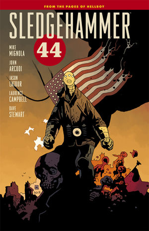
Sledgehammer '44 TPB

Now this is interesting. With Mike Mignola’s monster-bashing hero Hellboy in a mighty strange place, I like seeing Mignola and John Arcudi bring in another working-class hero to bash Nazi’s and smash monsters. The visuals between Sledgehammer and Hellboy are mighty similar, with the baggy pants, bulky bodies, and thrashing fists.

But while the visuals are similar, the leads’ personalities are very different. Hellboy is a working class guy doing his best with a simple approach. Sledgehammer is more of a sad-sack barely willing himself into heroics. Its’ actually a tad more complicated than that, as there are multiple guys using the Sledgehammer name and powers in the first trade. Neither of the two driving personalities are very dynamic, although the second is at least determined once he gets moving.

The first few issues follow Sledgehammer’s initial deployment in the theaters of World War II. It’s a fun story, focusing more on the “support” team backing ‘Hammer up. The idea of the soldiers as backup is driven home in the dialogue, making it a lot more shocking when the soldiers end up having to carry the load. There are some fun, straight-up war sequences in the first limited series, totally devoid of any horror or supernatural elements.

The second arc gives ‘Hammer a super-villain to fight; the Black Flame. I can’t remember what we’ve seen the Flame do before, but in this he’s zooming through the sky and blasting into the ground like a comet. He’s much more of a superman than I remember, but he does make for an intimidating opponent. Sledgehammer does OK against him, but man, the Flame seems to have him outclassed. Again, keeping the story grounded with lots of soldiers and low-powered protagonists keeps the book grounded.

Jason LaTour and Laurence Campbell have different styles, with LaTour’s faces on the American soldiers almost looking like the Sunday funnies. This doesn’t take away from the drama in the story, but the look gives the opening arc a very different feel than normal BPRD titles. He does a crackerjack job on the Nazi super-robots, though!

Laurence Campbell has a grittier, tighter style that really works for the Black Flame. There are two or three sequences of mid-air combat that really impressed me. Setting the super-fight in the clouds surrounded by bombers and thunderheads makes for a hell of a dramatic and cinematic sequence. This is good-looking stuff.


This is still a GOOD comic, but it isn’t as good as BPRD and Hellboy. Those other books have had years to establish themselves, so I have hope for Sledgehammer. But for now, this is very far behind the other titles in the Mignola-universe. 

Friday, October 24, 2014

Batgirl v4: Wanted HC

I think there might be something wrong with Gail Simone. When I write, I can come up with depressing and dark stuff. But Gail Simone has done it for so long, and done it so well… let’s just say I’m glad I don’t live in her neighborhood!

This book picks up with the new Ventriloquist, and my goodness, she’s a sicko. She’s a sociopath who started murdering as a child and hasn’t really slowed down. She kills famous people in an attempt for fame, but she also kills lots of random folks just to do it. This is about as new 52-y as you could hope for, if you are into bloody violence and murder!

 I must absolutely point out that Batgirl always responds to the death and violence in a heroic, appropriate manner. This isn’t the darkening of a hero; this is a hero trying to maintain a light in the darkness, which is much easier to take.

I’m not saying it isn’t well done; it absolutely is, but man! Simone continues to have a wonderful voice for Batgirl/Barbara Gordon. Babs is experiencing some major doubt after seemingly killing her murderous brother in the last arc. Jim Gordon witnessed the whole thing, and now Batgirl is public enemy #1 as the commissioner unknowingly targets his daughter. 

Simone does a nice job balancing the interpersonal drama here, including some new love interests for Babs. I really like the idea of Barbara dating a guy who is a bit damaged, so the romance has a nice star-crossed lovers feel to it. The warmth of the guy’s family does a lot to make the whole interaction sweeter too.

The art from Fernando Pasarin and Daniel Sampere is so effective in its use of the DC House style that I’m not sure I can really even comment on it! All those buckles, cowls, and strange detail lines are ever present on Batgirl and the villains are dark, spooky, and blood spattered. You sort of know what you are getting here!


This is an OK Batgirl story. I didn’t love it, didn't hate it. But I’m happy that there is a book featuring a competent, heroic hero in the new 52! 

Wednesday, October 22, 2014

Nova v3: Nova Corpse TPB

Much to my surprise, I’m still enjoying the most recent take on Nova. Gerry Duggan isn’t reinventing the wheel here, but through a clever use of guest stars, decent villains, and snappy dialogue, the current Nova series is moving along nicely.

This trade focuses on Sam Alexander’s first extended space-mission as he travels the galaxy searching for other Novas. The problem is every one he finds is dead. Duggan has a nice, if obvious twist near the start of the arc, but it is a good way to bring in guest star Beta Ray Bill. Bill isn’t exactly an A-level star these days, but his presence still lends a sense of legitimacy to Sam in the suit.

The two of them are hunting down a cosmic slaver/weapons thief, so naturally the chase leads the two protagonists to Knowhere. I was pleased to see one of my favorite DnA-era Guardians show up. This character’s acceptance of Sam again adds legitimacy and permanence to Sam’s role as Nova. I won’t lie, I’m still desperate for Richard Rider to come back, but Sam is at the least tolerable.

One of the high points of the series is Duggan’s take on Sam’s youthful voice. Sam is irreverent, frequently overwhelmed, and wholly likable. This comic is one of my daughters’ favorites; I’ve said in the past how they call Sam “their Nova.” Well filling his word bubbles with amusing and self-depreciating comments only adds to their affection.

My favorite villains of the storyline are the dark space knights. Under the pencils of Paco Medina and David Baldeon, they truly look like evil ROMs. I’m not the biggest fan of Medina’s pencils, but he does put a great sense of energy in every page. I’ve always enjoyed Baldeon’s work, especially on teenaged characters. His Sam looks good, of course; I’m more impressed at how powerful and cool Beta Ray Bill looks.


This isn’t my favorite comic, but it is GOOD for what it is; a new-reader accessible character enjoying all-ages adventures in the cosmic Marvel U. (Now just bring back Richard Rider!)

Monday, October 20, 2014

She-Hulk v1: Law & Disorder TPB

On my first read, I don’t think I liked Charles Soule’s She-Hulk #1 enough. It was a decent enough issue, pitting She-Hulk against Iron Man in a legal conflict. I’d been hoping for a bit more fisticuffs, so while I liked it, I didn’t love the title at first.

Now I feel differently. Soule’s ear for dialogue is his greatest skill, with She-Hulk, Photon, Hellcat, and guests like Kristoff Vernard (Dr. Doom’s “son”) all having unique and interesting voices. Soule is in full-on “establish” mode here, making sure to include a fair amount of guest-stars to the proceedings. Matt Murdock, Hellcat, Tigra, Shocker, and more all show up when the focus switches to the “Blue File.”

Most impressively, minor footnotes from Marvel history show up too. I don’t remember anything else about Nightwatch other than that he looked like Spawn, but Soule does a good job making seem like an elder statesman. Nightwatch, people! Seriously, how many people even know who that is? Soule knows his comic book history!

This is She-Hulk’s book; as she’s probably my favorite Marvel heroine, I was worried the focus on her legal career would leave me cold. Instead, I love the workplace drama feel of Jennifer Walters and her employees. Shulkie has a great, scrappy partner (Hellcat) and a new, mysterious paralegal with a monkey pet that is clearly more than meets the eye. One of my favorite aspects of the title is that She-Hulk’s career as a super-hero is clearly the most successful part of her life. Her legal and professional struggles do wear her down, but man, she can still kick butt when she needs to (and that fact is brought to life by Kevin Walda’s excellent covers).

Javier Pulido’s cartoony art wouldn’t have been my first choice. He makes Jennifer look a bit plump, and his tendency to draw everyone with staring eyes might have been distracting. Now I know better and appreciate the unique look and the fact that the art makes the book different than the “super-hero” books next to this title on the stands. This is another book I now read with my daughters, and man, do they love it. I think this might be their #1 book these days. Pulido’s art gets a lot of that credit. They love his facial expressions on the lead and her best friends (although they are a tad weirded out by Hellcat’s eye-slits on her mask).

Ron Wimberly does pop in for an issue of guest-art, and man… I know a lot of folks really liked it, but that is too far out there for me. The fish-eye lens, the rubbery limbs, I fear this isn’t a great fit for the book. I understand it is courting Hawkeye readers and other folks looking for something different, but Wimberly’s art is just too out there.


This is an EXCELLENT comic featuring one of my favorite characters in solid action every month. Even with the focus on super-hero law, there is always some sort of action so we don’t forget She-Hulk is a superhero.